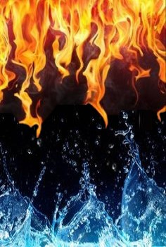
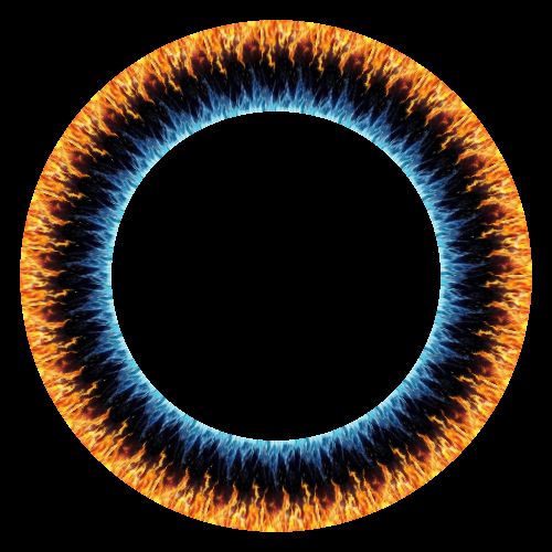
fire and water $ ( re uploaded and edited from author Dimitry)
Description:
I just made it so there's less black space in the middle Scale 1.04 top spacing at 7 bottom spacing at 2 (if you have the water on outside track... use top and bottom spacing 3 and 3.) color saturation 1.3 Is it weird to have a favorite of all time? My personal recommendation is to have one poi with fire on top.... and the other one with water on top.


Comments
Please sign in to add comments.
